Remove and Replace bathroom remodel
New & Improved
In a remove-and-replace bathroom remodel the team updates for function and elevates the design.
Out with the old, in with the new! This bathroom project is what we call, a “Remove and Replace” remodel and it’s not as simple as it sounds. Yes, the locations stay the same, but we still take the room down to the studs and rebuild. The end design features a beautiful arrangement of tiling, a bright shower design, and functionality throughout.
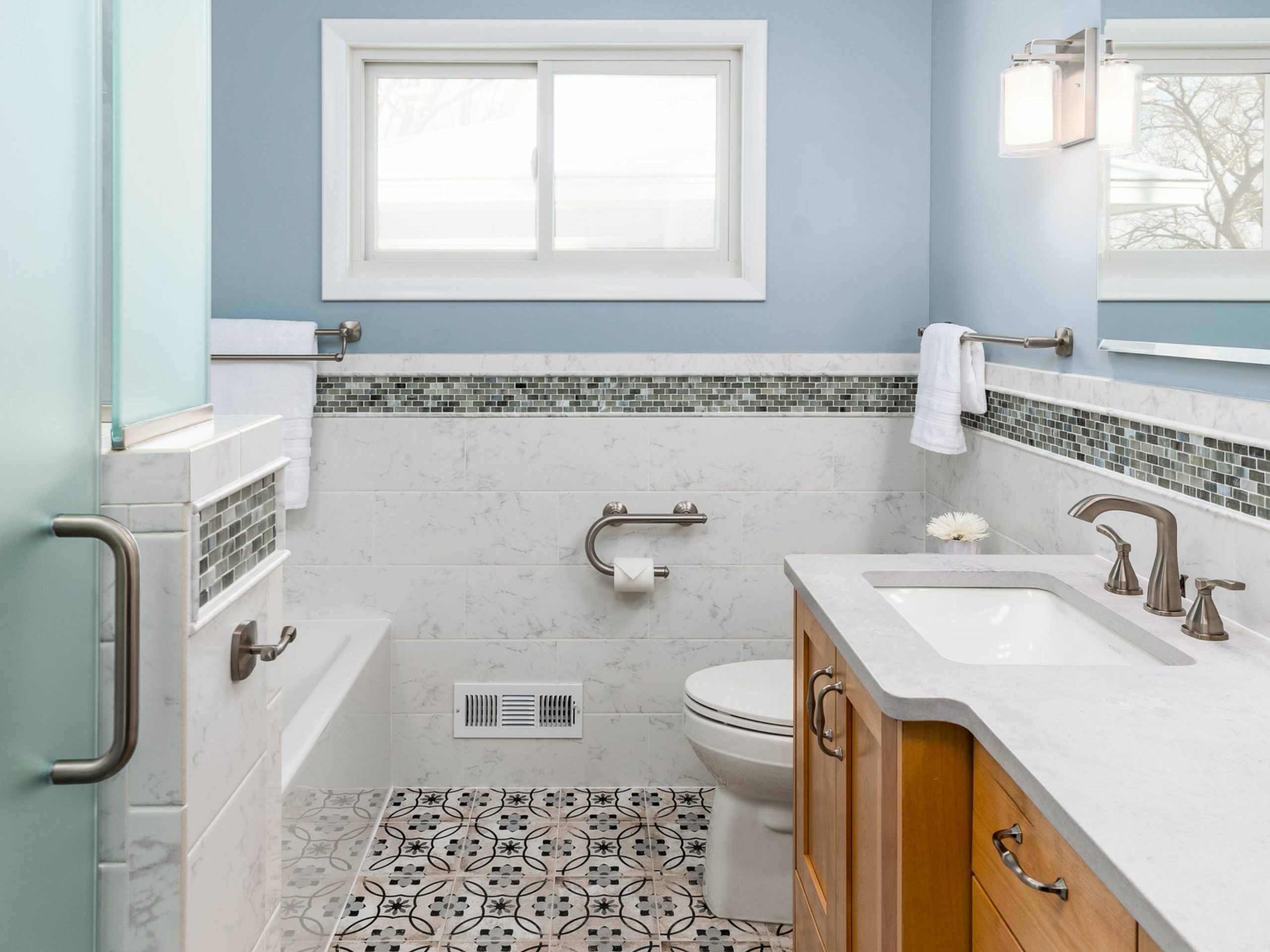
A beautiful tile combination steals the show
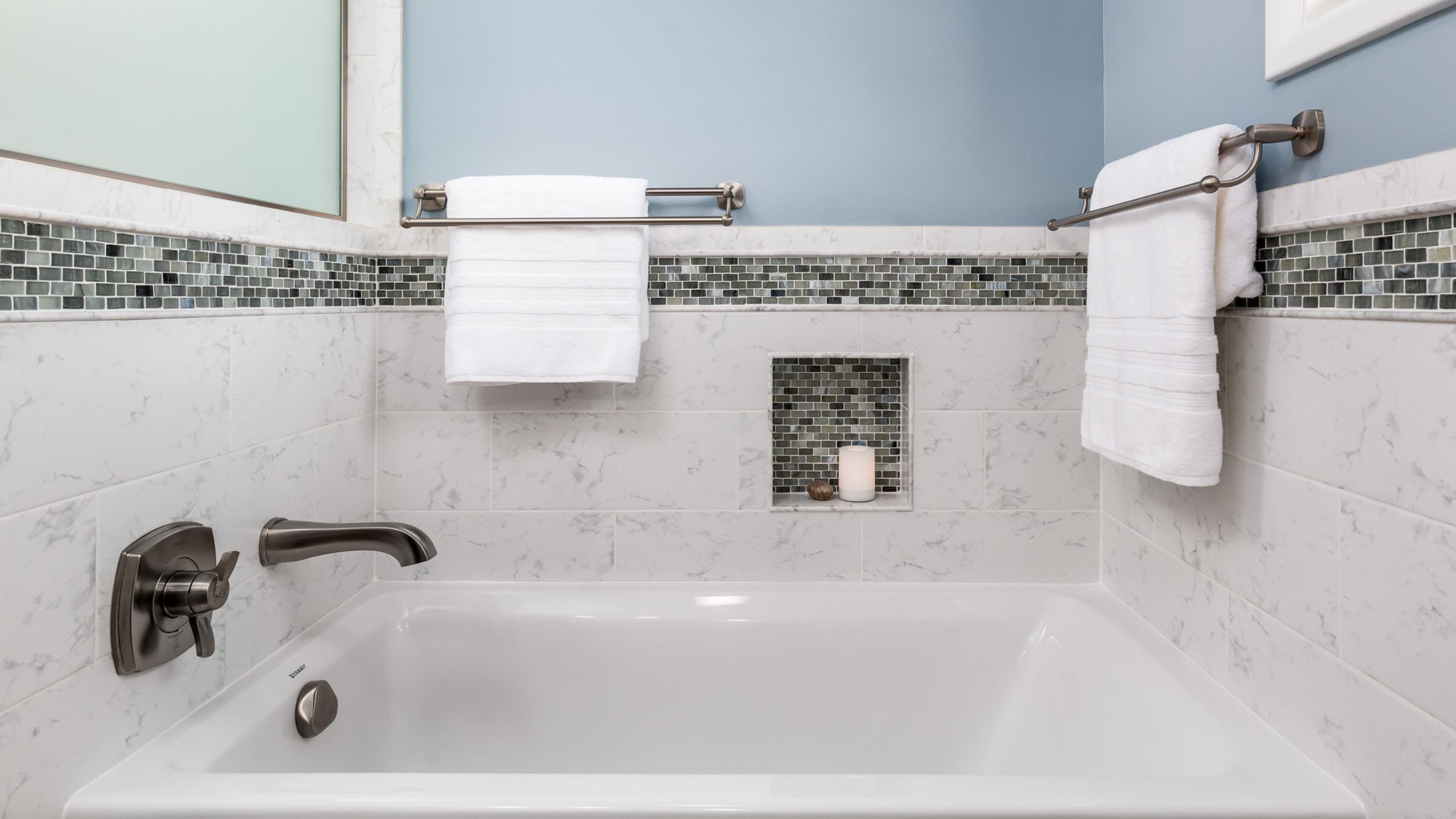
Wrapping around the bathroom is a tile wainscot with a detailed glass mosaic accent band. A large-format porcelain tile gives homeowners the best of both worlds. You get the high-end look and feel of marble, but is more cost-effective, durable, and requires very little maintenance. The floor tile is a vintage patterned tile in Monarch Gray and adds a pop of fun!
Move the slider to reveal the transformation
Before, the bathroom was outdated. Now a refreshed design with added functional features.
If you take a closer look, you’ll also notice the toilet paper holder doubles as a grab bar. We also installed solid blocking behind the walls in various locations for future grab bar installations.
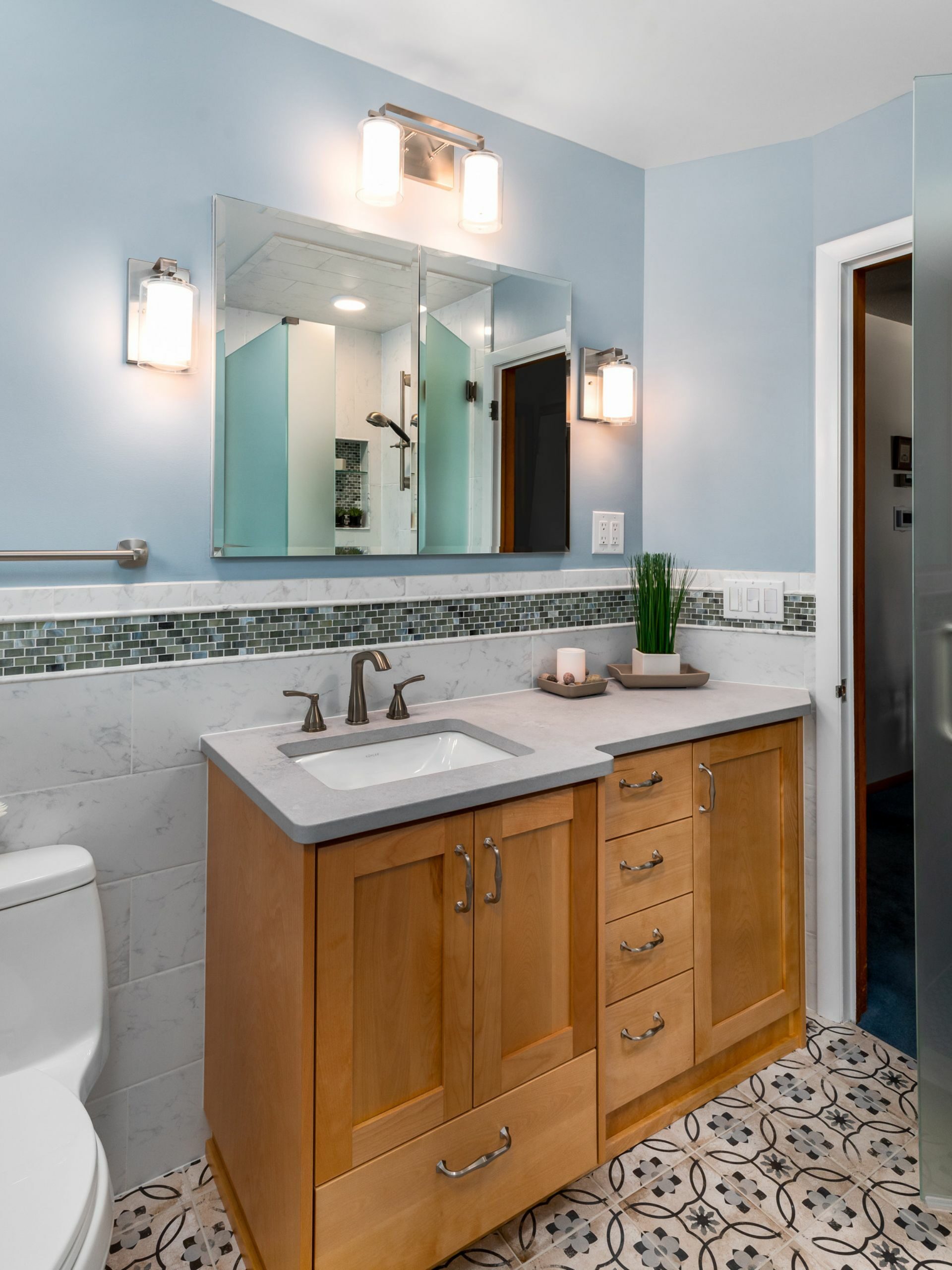
Maximizing storage and counter space
Design-wise, the double mirror medicine cabinet is an aesthetically pleasing choice because it’s proportionate to the size of the vanity. It also gives extra space to store those small bathroom products. The vanity size and shape accommodate the doorway and maximize storage and counter space.
Move the slider to reveal the transformation
A dramatic change in the shower! Before, it was dark, outdated, and a moisture trap. Now it is brighter and feels much more spacious.
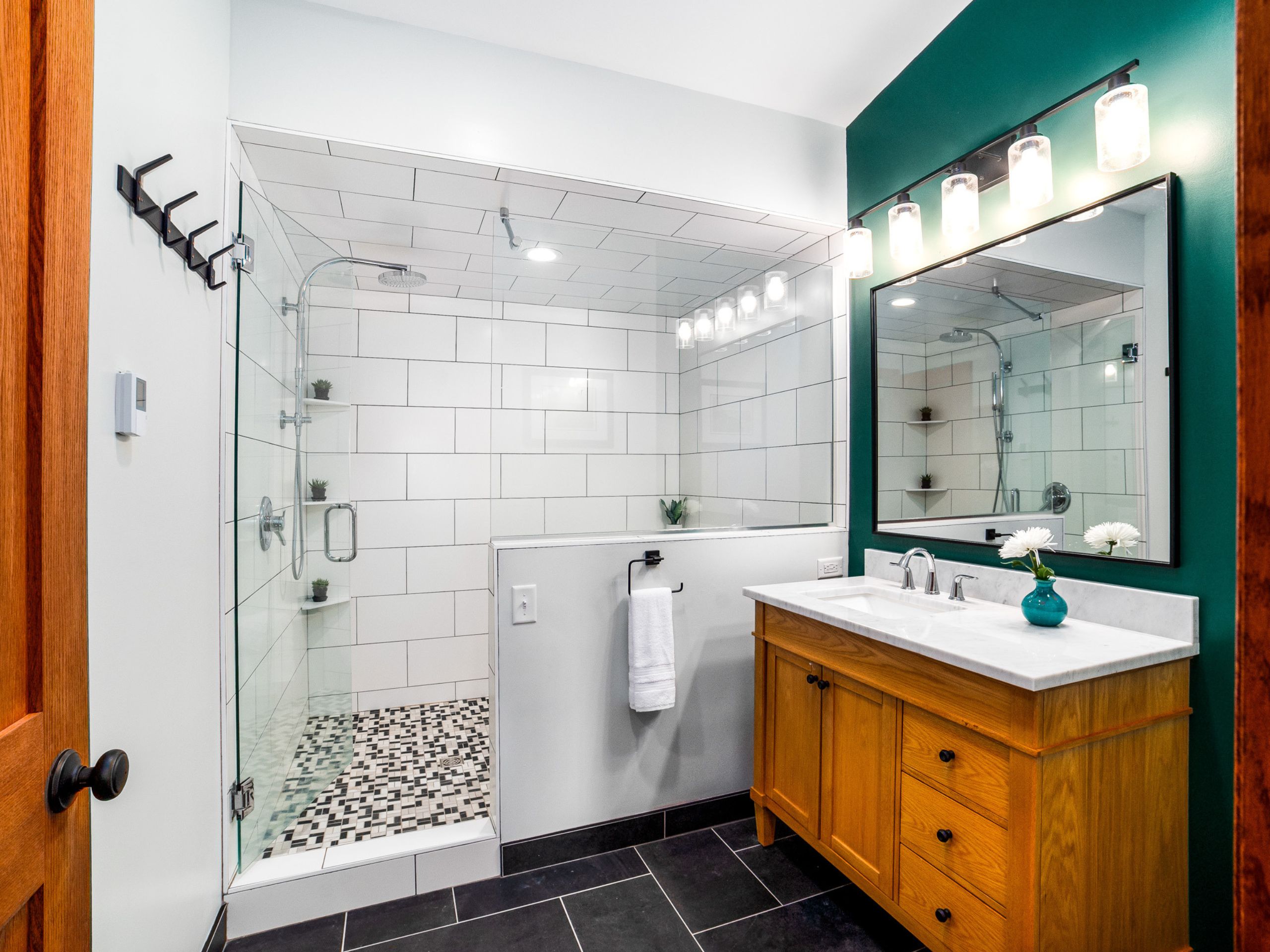
To brighten the shower space, we added recessed lighting and frosted glass on one wall which allows more natural light to flow through. Having more light is great for reading the small print on shampoo bottles, but it is also a great wake-up call in the morning. Notice how much bigger it feels too. In addition to more light, using a large format, light-colored tile creates the illusion that it is bigger.
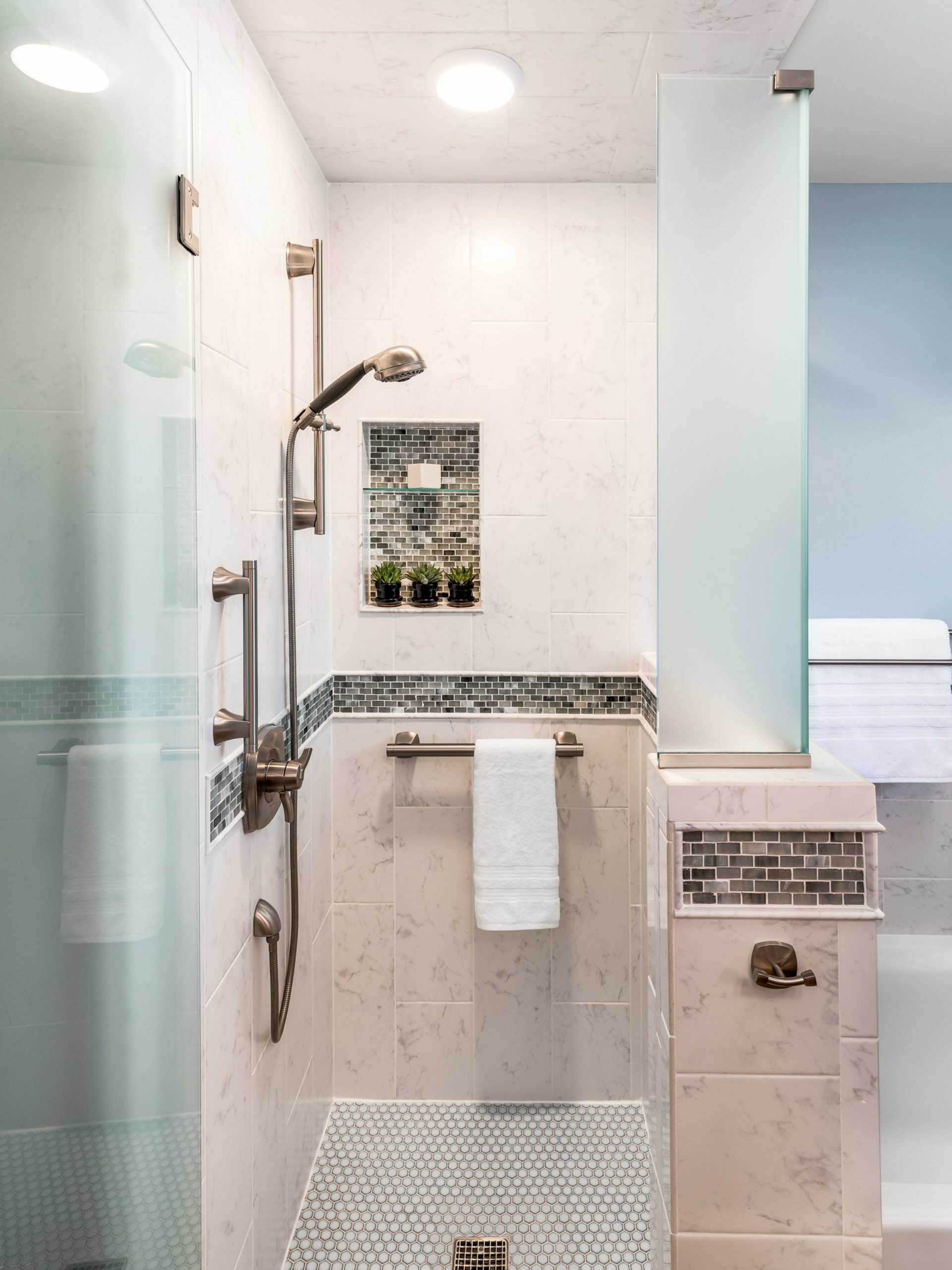
The lovely accent tile band flows into the shower.
For design continuity, the tile wainscot and accent band flow into the shower. We also placed two grab bars—the vertical grab bar is there to assist with entering and exiting the shower, while the horizontal doubles as a towel rack and support bar.
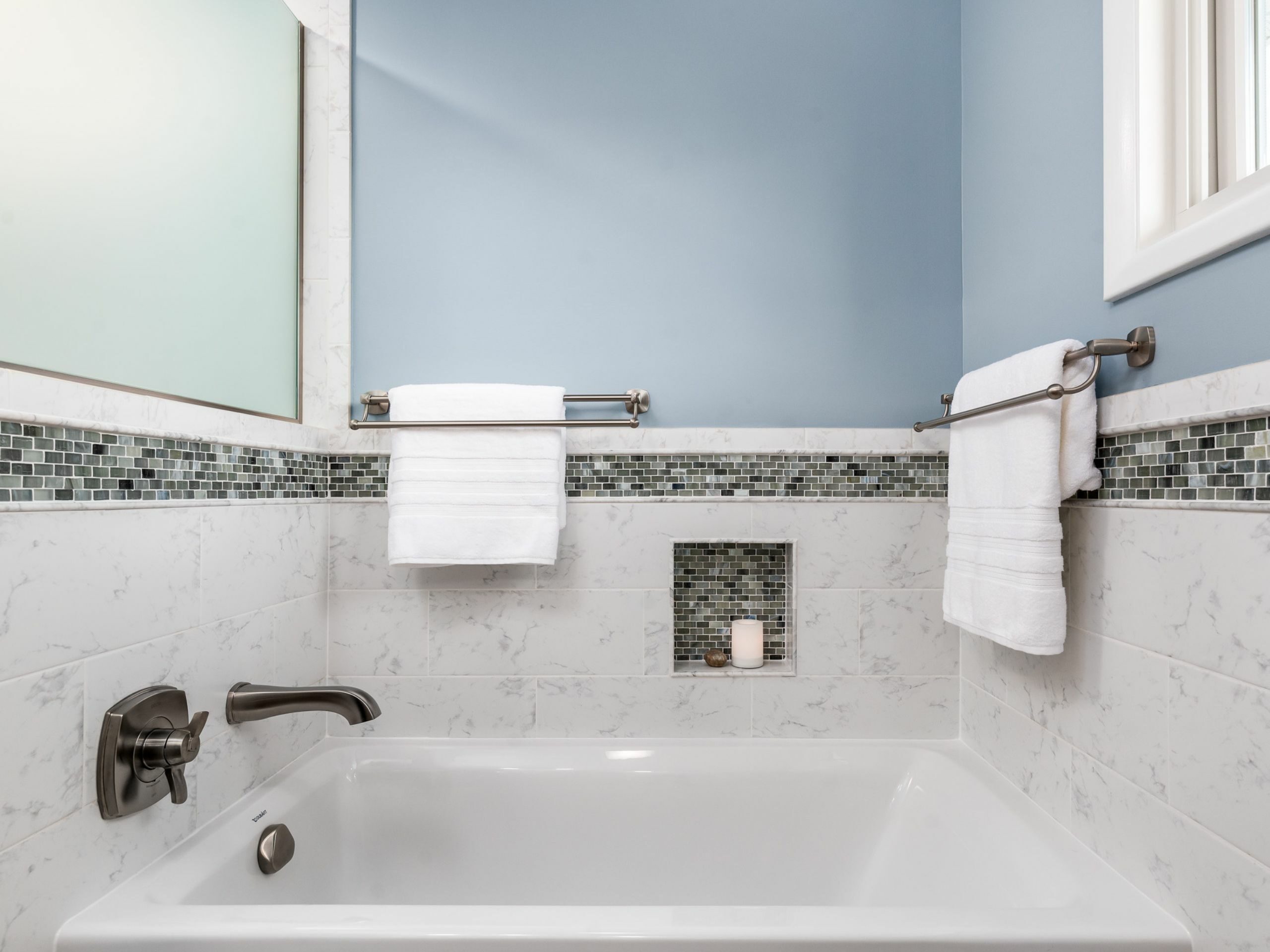
A relaxing tub with a bath niche to hold a candle bubble bath, and soaking salts. Two multi-towel bath racks keep plenty of bath towels easily accessible.

